Dark Streetwear Color Palettes: Black, Lime, Red & Bone
Three dark streetwear color palettes from the world after: black and lime, warning red, and weathered bone. Build each around a graphic tee and clothes you already own.

In this story
A green light is still running in a laundromat nobody uses. A red telephone waits in an empty lobby. Above a silent observatory, the moon keeps its schedule.
Different places. The same broken future. What changes the mood is the color left inside it.
That is a useful place to start with dark streetwear color palettes. Keep black as the foundation, use charcoal to separate the layers, then choose one accent: acid lime, warning red or weathered bone. The accent can live inside a graphic. You do not need a whole new wardrobe to make it visible.
Here are three ways to bring those colors into clothes you already wear, with OLD VEGAS graphics as starting points.
Choose Your Signal
- Black + lime: a black and green graphic shirt, washed charcoal jeans and black shoes.
- Black + red: a red-accent graphic tee, plain black trousers and a quiet outer layer.
- Black + bone: a monochrome graphic tee, faded black denim and one warm off-white layer or detail.
The outfit formulas are deliberately simple. The interest comes from where the accent sits, how much of it you see and the texture around it.
01 / Black and Lime Green: The Last Cycle
Picture a row of industrial washing machines after the building has been abandoned. Most are dark. One drum catches the light from a green emergency tube, and a fern has found its way through the seal.
In that scene, lime feels like a small system that has outlasted the people who installed it. Against black, even a narrow streak has somewhere to go.
To wear it: start with a black and lime green shirt and keep the trousers charcoal or washed black. Let the green in the artwork be the brightest part of the outfit. Plain black footwear gives it room without turning the whole look fluorescent.

Apocalyptic Rose is a useful example: a gray flower carries small green details, so the palette starts on the shirt itself. A faded gray overshirt can pick up the softer tones in the rose. Leave it open enough for the bloom to remain visible.
If you prefer lettering to a floral image, look at the Cyber Lime Logo graphic tee. Choose the artwork you would wear repeatedly; the color formula works either way.
Try this before adding anything: hold the shirt beside your trousers in daylight. If two fresh blacks merge into a single flat shape, try washed denim instead. The difference in tone may do more for the outfit than another green accessory.
One lime accent is enough to establish the direction. Add a second only if you like how it changes the balance.
02 / Black and Red: Nobody Called Back
The lobby telephone is still red. The notice beside it has faded beyond reading. Under the emergency light, a flower has come through a crack near the floor.
Red gives that quiet scene a sense of unfinished urgency. In an outfit, it can create the same point of attention while the rest stays familiar.
To wear it: pair a black shirt with red artwork with straight black jeans or plain dark trousers. Use a charcoal jacket if you want another layer. There is no need to match the graphic with red shoes, a red bag and red hardware at the same time.

On the Zombie Red Alert tee, the pale face creates contrast and the red warning details guide your eye across it. Keep that relationship visible. A zipped jacket that hides most of the print changes the effect considerably.
Try this in the mirror: put on the outer layer you actually use, then check the outfit from a few steps away. If only a fragment of red remains, decide whether that small signal is what you want. Open the jacket further when you want the full graphic to lead.
For colder weather, our guide to layering graphic hoodies covers jacket fit and keeping artwork visible.
03 / Black and Bone: The Sky Kept Its Hours
The observatory has stopped recording. Its telescope still points through the slit in the dome. Chipped ivory paint catches the daylight while the machinery behind it disappears into charcoal.
Bone is the warm off-white in this palette: closer to aged paper or worn enamel than bright white. It gives a dark outfit a softer point of contrast.
To wear it: start with a black tee carrying pale artwork, add faded black denim, then try an off-white overshirt, canvas bag or small footwear detail you already own. Pick one pale area and see how much contrast you enjoy.
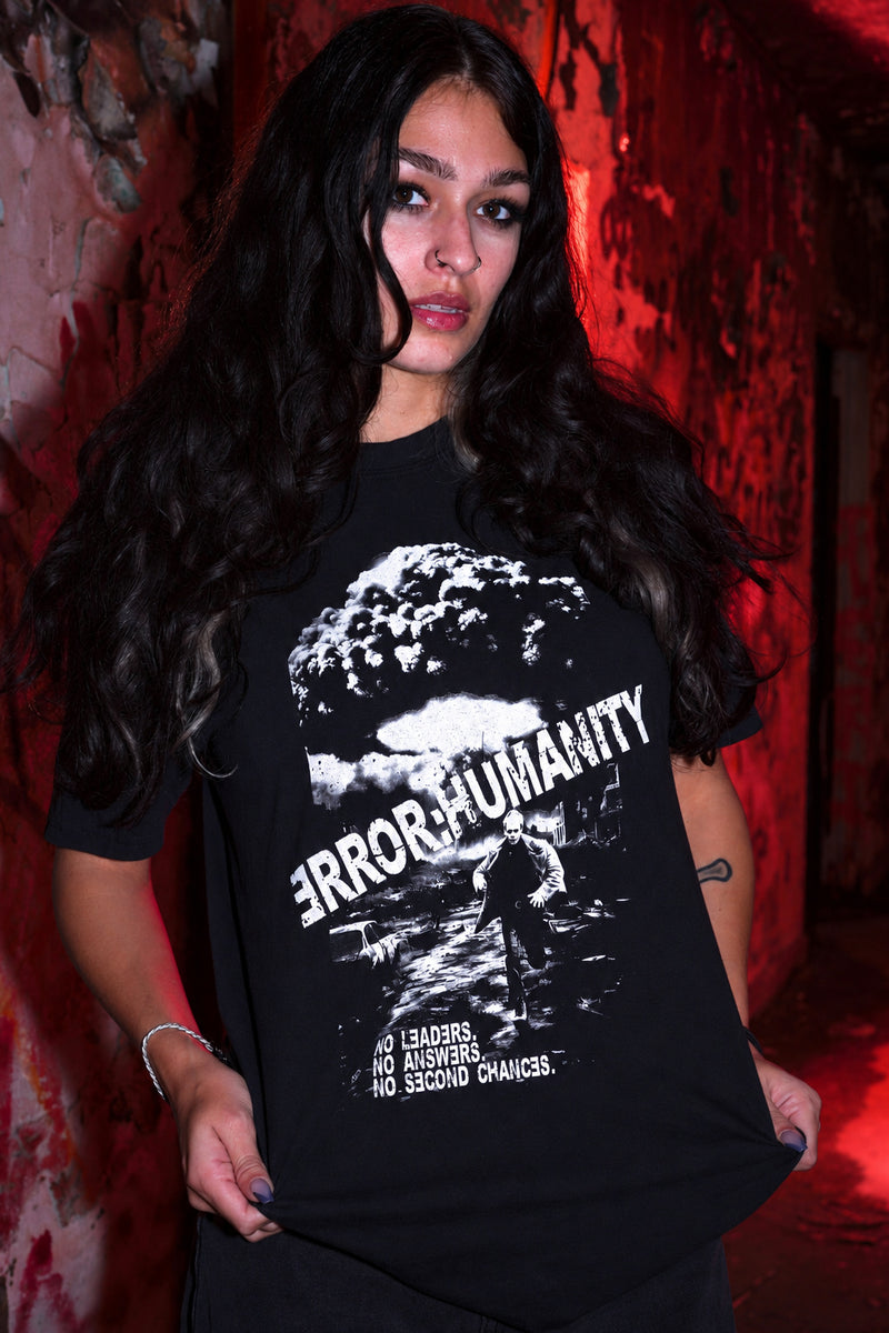
The No Leaders tee gives you a black-and-white graphic to build around. The bone tone comes from your chosen accompanying piece; the shirt itself is not being described as cream.
A whole pale jacket changes the silhouette much more than a light sole or a strip of fabric at the collar. Both can work. Start with the smaller detail if you want the outfit to stay predominantly dark.
Check the undertone: compare your pale pieces together in daylight. Warm ivory and cool bright white create different effects. Choose the one you prefer against the graphic rather than relying on a product photo taken under different lighting.
Make the Palette Work Before Buying More
Lay out one graphic tee, two pairs of trousers and your usual outer layer. Try each combination with the shoes you actually wear. Look for a clear focal point and enough contrast to distinguish the layers.
There is no exact percentage of black or accent color you need to follow. A small bright graphic can have more visual weight than a large muted panel. Take a quick photo from a few steps back if the mirror makes that hard to judge.
Use the palette as a way to choose between pieces you like. For broader styling choices, read how to wear post-apocalyptic streetwear. If you are comparing graphics themselves, our guide to what makes an apocalyptic shirt looks more closely at the artwork.
Explore the OLD VEGAS graphic tees →
Choose the signal you want to carry. Wear the aftermath.
Wear the aftermath.
Original art. Dark streetwear. Find your next piece in the OLD VEGAS archive.